Squadron Signal's
US Navy Ship's Camouflage WWII Pt. 1
Destroyers and Destroyer Escorts
Reviewed by Tracy White
Squadron Signal's |
|
| With this release it is clear Squadron is intent on releasing a series of books concerning US Naval camouflage in the second world war. By breaking it down by class they make this large and sometimes arcane topic more manageable to the casual reader as well as provide a convenient book for those whose interests might only follow one type of ship and who does not need a large compendium for the entire fleet. "US Navy Ships Camouflage WWII: Destroyers and Destroyer Escorts" is well laid out, with an introduction and separate sections for each measure of camouflage covered. For the most part the color profiles are laid out in their section, for a better and more coherent learning experience than earlier series where the color pages were always bound in the center, with each profile somewhat orphaned from its respective section. The color artwork is fairly well done; not exquisitely detailed masterpieces but excellent for conveying the purposes of what an individual measure or design pattern might look like. |
|
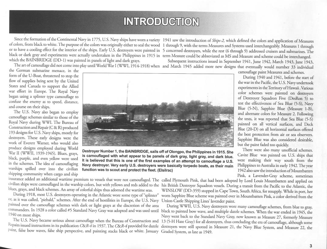
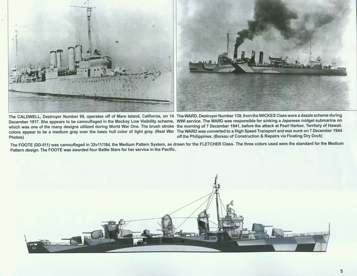
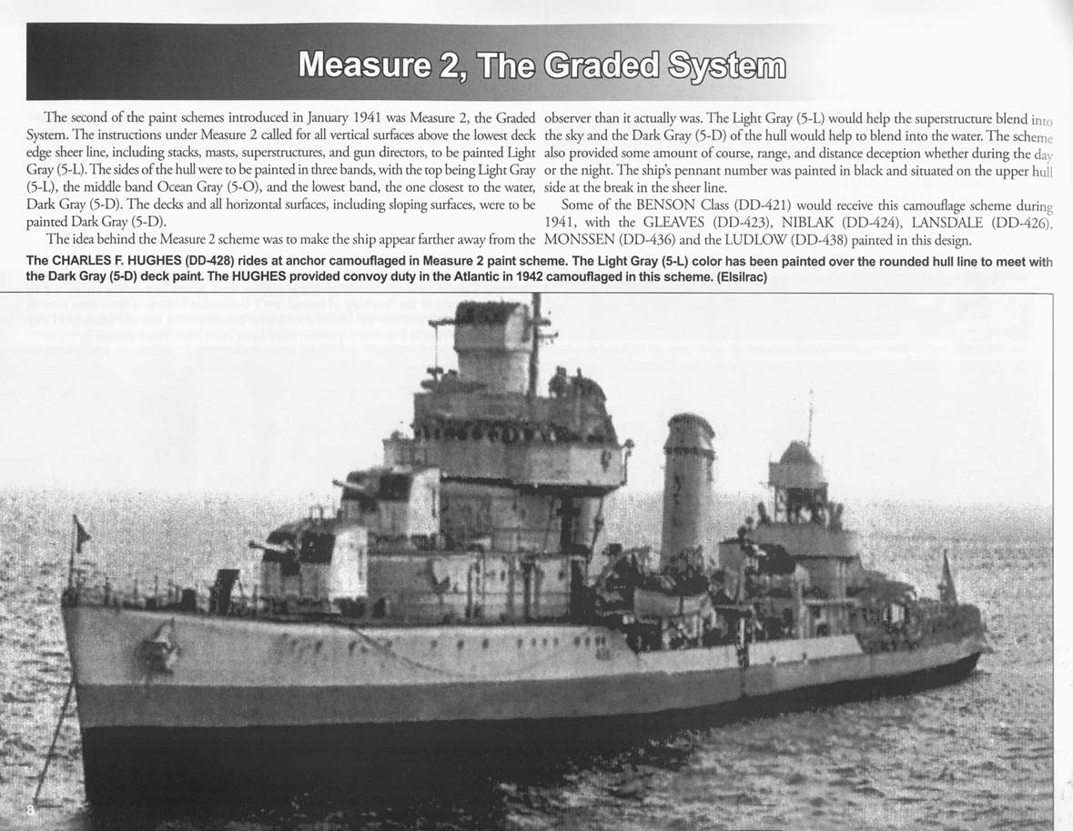
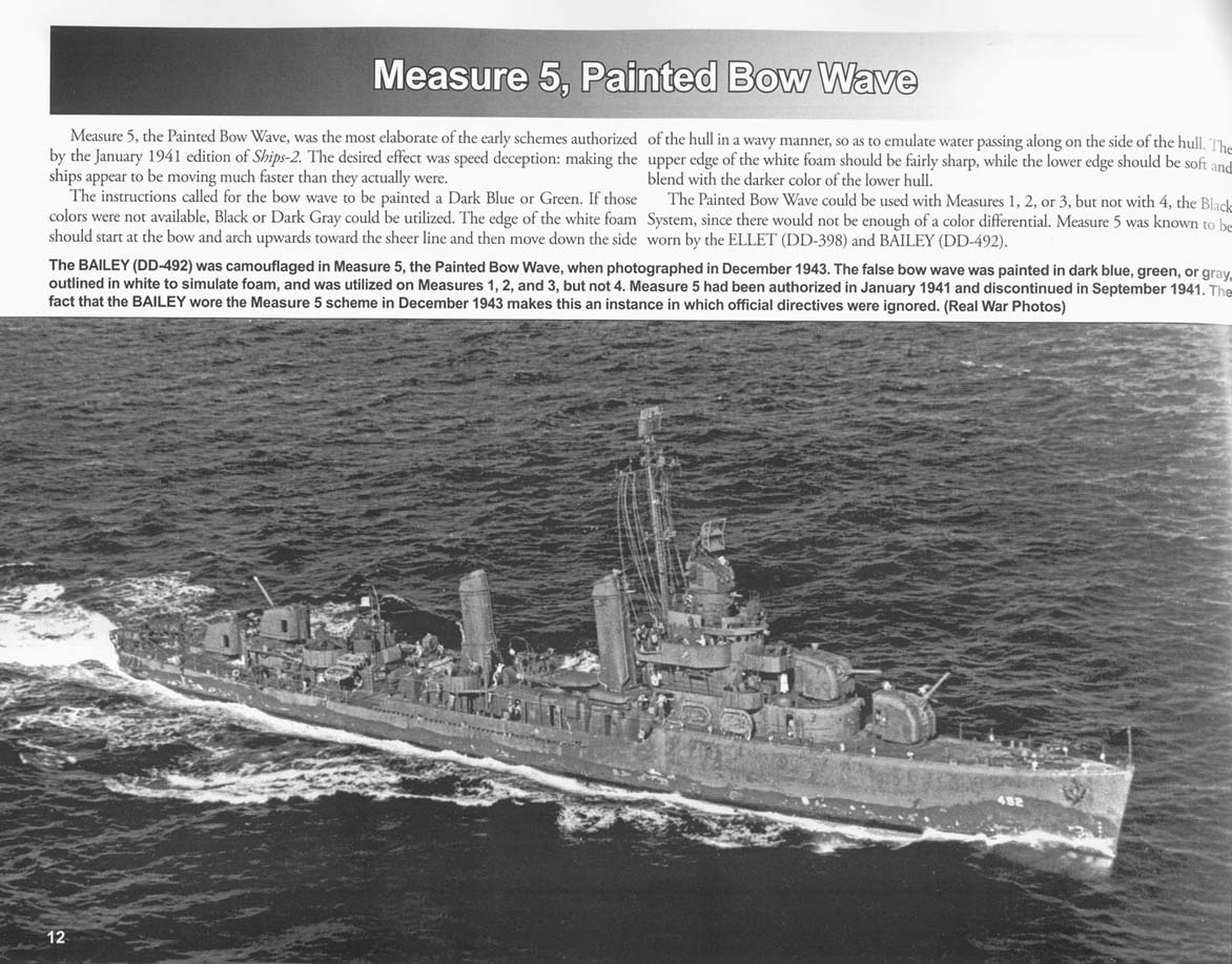
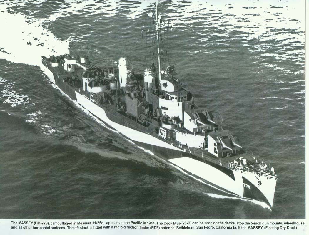
In order to better describe some aspects of the book I would like to take a step back for a minute and give a brief description and history of US Naval Camouflage. During the Spanish-American war, many US vessels used a dark slate color known by a few different names, including slate, Battleship Gray, "War Color," and it's official name of Standard Navy Gray. This color existed in use through the first world war but was phased out in the 20s and replaced with the creation of the Standard Navy Gray #5 we know as "prewar gray" in 1919. By the mid to late 1930's, the Navy was experimenting with camouflage again, and by 1940 large-scale testing was done with destroyer squadrons in the annual "Fleet Problem." 1941 was a year of great change for the US Navy in terms of camouflage, with the release of the official "SHIPS-2" Camouflage instructions in January of 1941 and a subsequent revision in October. Nine separate camouflage designs, known as measures, were released with the first SHIPS-2; Four were camouflage for surface ships (Measures 1-5), four were not designed to hide, but to confuse by attempting to mask speed or make one type of ship look like another (Measures 5-8), and the ninth was for submarines. Measure 1 was a Dark Gray camouflage; Measure 2 was graded, with darker paints changing to progressively lighter paints as the ship went up; and Measure 3 was a light paint system designed more for hazy and bad weather theaters. When the US Navy began revising SHIPS-2 (there would be three official revisions during the war and some later ones that were not re-issued as an all-new SHIPS-2) they kept the five original Measures and modified them in terms of the colors used; the revised measures were simply renamed with an extra "1" in front, so Measure 1 became Measure 11, then later Measure 21 when it was modified again. Likewise, Measure 2 became Measure 12, which became Measure 22. When the Measure 31/32/33 "Dazzle" schemes were released, this convention did not apply as much other than the fact that Measure 1/11/21 and 31 were the "Dark" color systems and Measures 3/13/23 and 33 were "light" systems. These dazzle schemes were unique patterns that were created by overlaying a master pattern over the silhouette of particular class or type of ship and creating unique designs for each side and surface. That is a brief history of the "system" of the Navy's camouflage to help understand a bit about what we are discussing below; for more information I would suggest the excellent (and ModelWarships.Com sponsor) ShipCamouflage.Com and my own site's section on WWII US Naval Camouflage here. In reading through this book, it is clear from the first paragraph that the author's understanding of USN Camouflage is limited; suggesting he put together quick descriptions from other sources and did not really study the subject enough to reliably understand what he was writing about. Moreover, unfortunately for the artwork mentioned above, this lack of knowledge was passed on to the artist, who pulled off more than a couple of well but incorrectly rendered profiles. There is also evidence of either poor or a complete lack of editing in the form of numerous typos; for example USS Fletcher is referred to as DD-448 in a caption on page 2 and there are at least two instances where a Navy base at "Pear Harbor" is referenced (pages 6 and 66). There is a one page introduction that covers the general history from the First World War through the end of the Second. "Splinter" schemes, as they are labelled, are also said to have been referred to as "piebald schemes." Piebald refers to a black and white coloring, and skew bald refers to white and any other color, but neither term was ever used in official documentation of the US or Royal navies. #5 Standard Navy Gray is listed as being adopted in 1928; it actually dates to 1919 when it replaced the earlier Standard Navy Gray. Adoption of the new gray was slow due to budget constraints following the end of the first world war. Later in the introduction, it is stated that the terms "Measure" and "System" were used interchangeably, which is incorrect. There was Measure 1, the "Dark Gray System," but one never sees "System 1" or "Dark Gray Measure" in manuals or correspondence. Measure was used with a number following, and "System" would be used with terms like "dark" "medium" or "Light." Measure 31 was the "Dark Pattern System" for example. The introduction would lead the reader to believe that US camouflage experiments started in the waters off of Hawaii in 1940 with DESRON FIVE, in fact, experimentation started well before the 1940's and saw DESDIVs SIX and SEVEN painted completely black up to the topmasts, above which was to be "War Color." The experiments the author is referring to were not actually ordered until October of 1941 and the Navy Blue Measure 1C scheme not until late November. While the book states that 5-S was found to be the most effective, textual records state the opposite, the report from the Commander of Destroyers, Battle Force, stated, "The various paint shades in order of their effectiveness in concealing ships from aerial observers are (1) Sapphire Blue, (2) Formula 5-D, (3) Formula 5-N, and (4) Formula 5-S." (http://www.shipcamouflage.com/pearl_harbor_experiments.htm - Second document) Cavite Blue is stated to have been applied in early 1942, when it actually started in the fall of 1941. (Reference One, Two, and three) The last paragraph of the introduction continues the stream of mistakes and completely fails to mention the amphibious green camouflage measures painted on destroyers and destroyer escorts converted to APDs and provides no mention of the 1945 shift to neutral gray paints due to the shortage of blue pigments the Navy faced in 1944. No mention of either is ever made or shown in the book text or artwork. Following the introduction are two pages of black and white First World War DD photos, but the bottom of the second page contains a color profile of a Fletcher class DD in 1943 camouflage. At this point in the book no mention of the WWII dazzle schemes has been made and the text does not distinguish this as a second world war scheme or destroyer, which may lead to some confusion. Measures: Measure 1 Measure 2 Measure 3 Measure 4 Measure 5 Measure 11 Measure 12 Measure 13 Measure 14 Measure 15 lists "speculative" colors including 5-S Sea Blue, despite the fact that the color was no longer being manufactured and was being used up on less important ships and craft. Why would you test a NEW scheme using old colors you didn't have in production any more? Mountbatten Pink Comments on Measures 15-18 Measure 21 Measure 22 Measure 31 The pictures sometimes leave something to be desired in their selection and reproduction. There are four photos of ships in pattern 3D, for example, and all of them are showing the starboard side, with no examples of the port side presented. DD-592 Howorth's caption on page 49 describes her Measure 31/21D as "modified" due to a patch of 5-O paint, when in actuality the section is totally black, and the lighter patch is just not in the shadow from the overhang of the bow. The full-page photo of USS Massey DD-778 on page 50 is of such poor reproductive quality as to be nearly useless, with severe grain and over-contrast obliterating most detail; it looks like a second generation photo-copy. While it may show the general pattern, those using it to reproduce it on a model may have difficulty placing the lines due to the lack of referencable detail. Finally, an obscure detail is missed in that some ships of the Benson class (at least) had their 3D patterns swapped port and starboard, which may lead to some confusion in identification of ships. Measure 32 The photo of DE-387 Vance on page 54 is so blown-out and light that for most of the ship one cannot tell the difference between the 5-L and 5-O paint. The caption for DE-408 Strauss on page 55 states the 22d pattern called for Black & 5-O Ocean Gray, when the Design sheet actually called out for 5-L Light Gray and Black. Design 13D is described on pages 58 & 59 as consisting of 5-L Light Gray and 5-O Ocean Gray on vertical surfaces when it was actually 5-L and black, with the 5-O used only on the deck pattern. The photo of DE-5 Evarts on page 61 is described as showing her changing from Measure 31 to Measure 32, when examination shows that her paint is just really weathered and an earlier application of Measure 22 is starting to show through. Measure 33 The caption for the photo of DE-231 Cross on page 64 states her camouflage "is unusual in that she carries Measure 33/3d Modified on both the port and starboard side." I'm not quite sure where the mistake lays; whether the author was trying to imply it was abnormal for a ship to have the same design on both sides (false in that the vast majority of design patterns were released with patterns for BOTH SIDES of the ship) or if he was trying to state she had the exact same design painted on both sides (also false, as her Navsource page shows). It is true that there were ships that had different design patterns on different sides, or one side of a particular design sheet applied to both sides, and in some cases the port and starboard sides were reversed, but no mention of made of this or any other variations in the text. Curiously, the last picture in the Measure 33 section is of USS Drayton in her "Blue Beetle" Sapphire blue during experiments before the war; while this was probably done to fill up some color-printed space I think it would have been better served with a color shot of a dazzle scheme as there is not a single color dazzle photo in the entire book. A final correction; the photo of Buchanan on the very last page lists the vertical colors as 5-H Haze Gray, 5-O Ocean Gray, and 5-S Sea Blue; in actuality the 5-S had been replaced with 5-N Navy Blue. Comments on Designs: Pattern 1D is described in many of the mid-book profiles as 5-L/5-O/BK on vertical surfaces when in fact 5-O was only part of the deck pattern and the vertical surfaces were painted only in 5-L/BK. This erroneous description also appears in the Measure 31 section. The USS Compton is listed on page 43 as being in Ms 32/11D when it should be 11A. There is a slight error in the pattern as well; one area that is shown as being just 5-O should be 5-O and Black. Page 52 makes note of the differences in pattern 3D between two ships and states the reason to be that the painters of one "interpreted" the pattern; no mention is made that there were different design sheets issued for each class of ship and the two ships being compared are, of course, different classes. While there WAS interpretation of designs in cases where a specific design sheet for a specific class was not available, the failure to mention that there were differences in patterns for different classes leads to a flawed understanding of the camouflage system, in my opinion. Moreover, the caption on page 54 for USS Bray's Ms 32/3D says that an additional panel of 5-L was added to the bow area; this is part of the 3D design sheet for the Evarts class and should not be construed as painters interpreting designs. CONCLUSION AND AFTER WORD: Squadron/Signal "in Action" books to me were always a good first source of information on a topic; not as in-depth as some books but a good amount of information on variants, color, and history of any given topic with a couple pages of color artwork thrown in for good measure. Originally an aircraft-focused series, they have released the odd ship title over the years with an increasing stream the last decade or so. However, with this has come some criticisms; some photos displayed "jaggies" from the use of low-resolution jpg images and evidence of quick or limited research on a topic. The 2009-released "US Navy Ships Camouflage WWII: Destroyers and Destroyer Escorts" regretfully continues this trend and in some areas takes it to new heights. This review was originally started to let the modeler who is potentially interested in the book make a decision based on my impressions, but there were so many errors, and so much that is wrong in this book that I felt it was also necessary to provide a list of corrections so that those who come across this book in the future may have correct information. The intent of this review is two-fold; to both provide merits and flaws in the book as well as to publicly demonstrate to Squadron/Signal that they need to put forth a serious effort if this is remain a viable and trusted line of product. |
