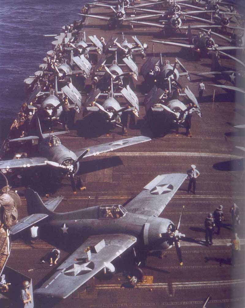
| This photomontage article is in response to the raging
thread about Hornets deck color at the time of the Doolittle Raid and
the assumptions made and poor photo interpretation done in support of various
arguments. Draw your own conclusions from whats presented here.
All photos listed as from the book are scans from Carrier Air War
In Original WWII Color by Robert Lawson and Barrett Tillman, ISBN 0-7607-1368-5.
Of the two authors, Robert Lawson has very good credentials as he retired
after 26 years in the Navy as a Senior Chief Photographer and has since
worked as a photojournalist and consultant. All photos listed as from
the Web are from various websites and can be found exactly as presented
here with a little google searching. In no case have I done more than crop,
resize or rotate an image; there have been no color, gamma or brightness
corrections nor did I set any software used in the cropping, resizing,
rotating or scanning processes to do any of the color, gamma or brightness
correcting on its own. Scans were done at 300 dpi, 24 bit true color RGB
mode, high quality photo setting (which turns off the descreen filter on
my software). Unless otherwise noted all photos are owned by the US Navy.
My comments will be below the photos with date indications per either US
Navy sources or as stated in the book (all photos from the book can be
found on the web but the scans from the book are used because I can make
sure to scan with no color corrections and I cannot be sure web posters
have done the same). My main point is to show why you cannot accurately
base color decisions on B&W photos unless you know what colors it should
have been to begin with and have something of similar tone or color in
the right lighting conditions. Also you will see why you cannot always
trust color photos, especially photos from the web as you have no idea
what manipulations have been done. |
|
|
| The same picture of Enterprise CV-6 sometime during 1941
from two different sources. Notice the first photo has what appears to
be a wood color deck
this a picture from the web, the second is from the
book. Which is correct, probably the photo from the book due to one of
the authors backgrounds. |
click images
to enlarge
 |
 |
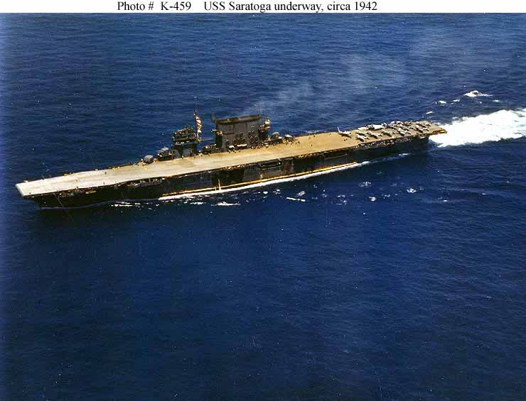
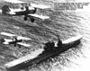
| From the web, this is the often claimed color shifted photo of Saratoga.
Some people have argued it cant possibly be color shifted. I can tell
you something is wrong with this photo, look at the waterline
..why is
there a streak of yellow there? Why are some portions of the upperworks
also showing distinct yellow tones? Either someone diddled with this photo
or there is something in the light that has caused that yellow streak and
given the apparent angles of the streak and the deck, Im thinking the
deck color is showing a similar effect of the light. My conclusion is not
to trust this photo for determining anything but the color of the water,
if that. |
 |
|
|
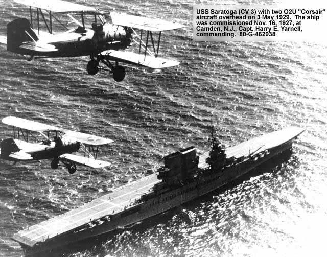
| A prewar photo of Saratoga with what is undoubtedly a mahogany stained
deck. Can you actually tell the color, of course not, the date and the
planes tell you what color the deck was
..using this photo to compare to
others in determining deck color is silly. See the angle of light, see
the glare? Photos with this much glare wont do you much good, especially
since there is nothing on the deck in the areas that arent in glare to
compare tonaly, let alone something like a plane with known colors to compare
the tone of the deck to. |
 |
|
|
| From the web, obviously CV-6 Enterprise and if the colors are correct
prewar from the planes. Looks to be in Ms11 for the ship. But something
bothers me, the picture looks like a colorized B&W photo, it just has
that feel to it
.something about the tone of the water and the shadows
under the stern remind me of the colorized photos in the WWII German magazine
Signal. Her superstructure and entire hull just look a little too neutral.
Id believe the color of this one only upon seeing a color negative. |
 |
|
|
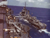
| From the web, one of many color photos of CV-8 Hornet at Norfolk in
February, 1942. Some have argued that the yellowish patch above the
liferafts is a section of deck, I doubt it
why would a section of deck
be pulled up and placed at that angle? It could be either a crate or a
section of canvas cheater hung over a rail, it really is hard to tell but
it assuredly is not a section of her deck. This photo is printed in B&W
in Warships Pictorial #9 (note the web photo has been cropped). One thing
does standout quite clearly, the golden wash effect that happens to old
Kodachrome films
..look at the white stripes in the flag, the sky and the
haze grey portions of the picture
see a hint of golden yellow creeping
in there? |
 |
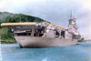
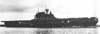
| From the web. A picture of CV-8 often claimed to be at Pearl Harbor.
I somewhat doubt this, look at her waterline, there is no chipping of the
paint (note there are two points midway along that are whitish, thats
her bilges being pumped). This certainly predates the Doolittle Raid where
all photos showing chipping along the waterline. Photos after the raid,
like the one below, show severe chipping. If this photo is from after she
crossed into the Pacific it is either at San Diego or San Francisco. We
can be pretty sure this photo is very commonly mislabeled as being at Pearl.
There is also some that Kodachrome gold happening. |
 |
|
|
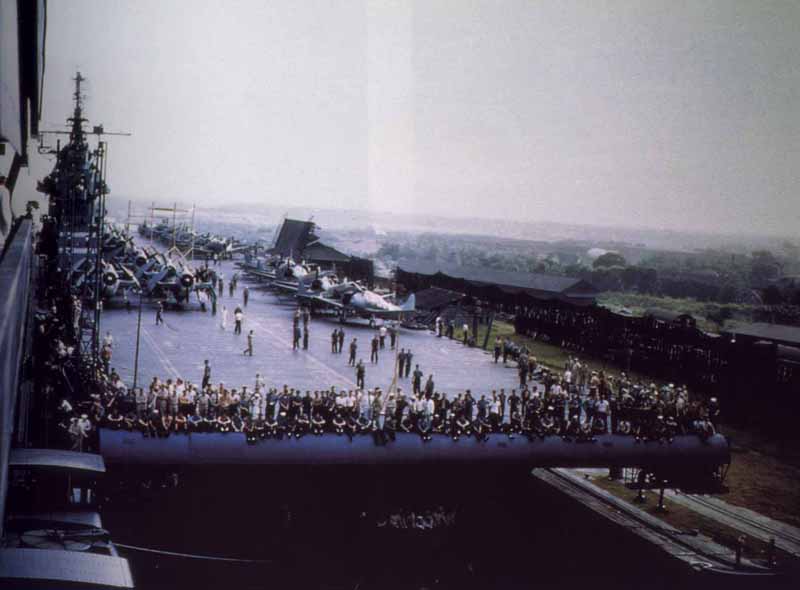
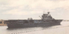
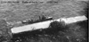
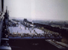
From the web. Hornet at Pearl shortly after the Doolittle Raid, notice
the severe paint chipping along her waterline. Photos of her bow and stern
areas show this chipping and the longer she is in the Pacific, the worse
the chipping gets. No photos of her in the Atlantic show this chipping. |
 |
|
|
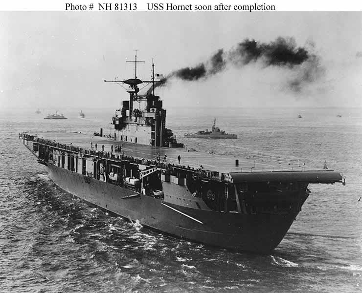
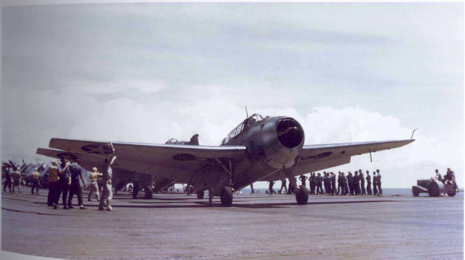
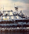
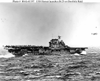
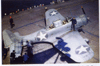
| Hornet during her builders trials in Ms12. There are a few things
we can tell, her deck is dark, it is wet, it has light stripes but there
isnt much else you can tell. Does the wetness make the deck appear falsely
dark? Does the glare off the wetness have any effect on the exposure? Again
since there is nothing on her deck of known color that is close to the
tone of the deck, making inferences about deck color with this photo is
pretty pointless. |
 |
|
|
| From the web
.a well known photo of Hornet in her death throes. By
this time we know her deck was 250-N but the photo doesnt tell us that.
What we do see are a bomb hole with scorching, water streaks on her foredeck
and light reflecting off the painted metal strips on her deck as compared
to the stained wood surface. We do see her stern rounddown is much lighter
than the deck but this could be glare. We also see that even though the
light reflects a little differently from the painted metal and wood of
her deck that the tone is almost identical. There is a good bit of glare
on her deck but the very aft portion is clear enough make a decent guess
that her deck is stained in a color close to the paint on the metal strips
which would have been 20-B and thus the deck would be 250-N. |
 |
|
|
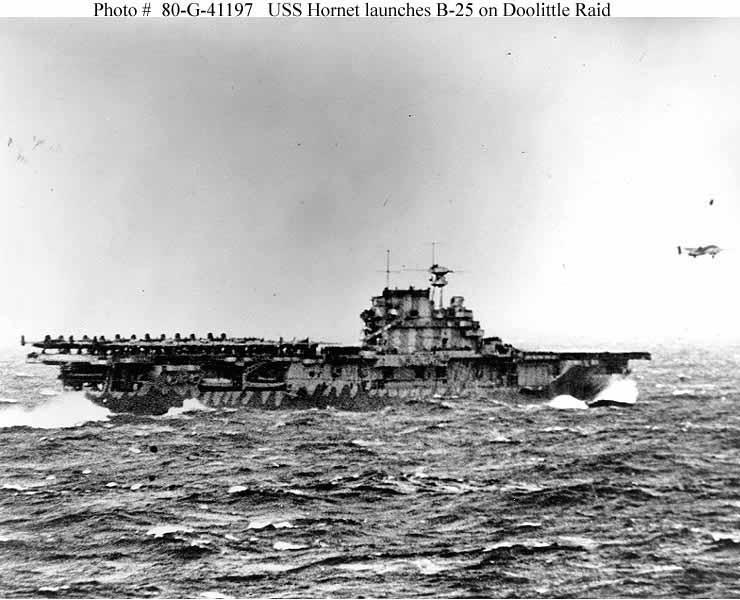
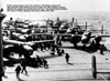
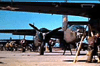
| From the web
..this is a photo someone told me showed the B-25s as
much darker than the deck and thus the deck must be wood colored
..Could
somebody point out to me a clear area of deck showing from the angle this
photo was taken? What this photo is useful for is determining the starboard
camo pattern and not much else for painting a model. |
 |
|
|
| From the web
.again used to argue the B-25s were much darker than
the deck as were the crews uniforms (to refute the uniform argument, see
later color photos showing that in fact most dungarees were much darker
than 250-N). Frankly, inferring that the B-25s are much darker than the
deck is flat out impossible in this photo.
..you either have glare off
the tops or extreme shadow on the planes, nowhere is any surface of any
plane shown at such an angle that the light is striking it at the same
angle it strikes the deck
.inference of deck color using this photo is
ludicrous at best. |
 |
|
|
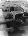
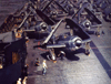
From the web
again used to argue deck color and a better
candidate than the previous
but there are problems with using this one
..the
aftmost B-25 wing and the deck have light striking at similar angle but
there are crew in between the two
..theres a better photo coming soon.
From the web
.again used to argue deck color
again we have a problem
with angles and light, not a good choice. |
 |
 |
|
|
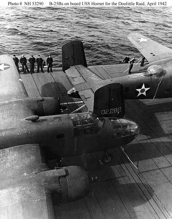
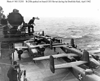
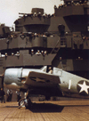
Here is a much better candidate for comparing tonal values
between the deck and the B-25s
..all this will give you is relative shades
since olive drab and 250-N are vastly different colors. Notice the tail
of the foremost B-25 and the area of deck just below its starboard leading
edge, they are at roughly the same angle and there is no glare or shadow
on either part (note the shadow is forward of the leading edge on the deck).
The cropped photo below is this area.
Ignoring the black edge of the tail, notice that it and the deck just
below it are very close in tone with the deck just a bit darker.
This is a fairly good indication that we are seeing a dark deck as the
OD used on the early war USAAC planes was fairly dark. |
 |
 |
|
|
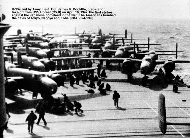
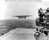
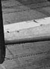
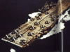
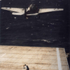
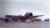
| Possibly the best B&W photo from the Doolittle Raid
for determining the shade if not color of Hornets deck. Look at the forward
B-25 and its port tail and upper fuselage and the deck right behind it.
We again have very close angles and tones. The photo below is this area
cropped.
We have an almost exact match in tone or shade here. There is no glare
or shadow, the angles are very close to each other as well. Ignore the
black leading edge on the tail
thats a rubber deicer boot and is black. |
 |
 |
|
|
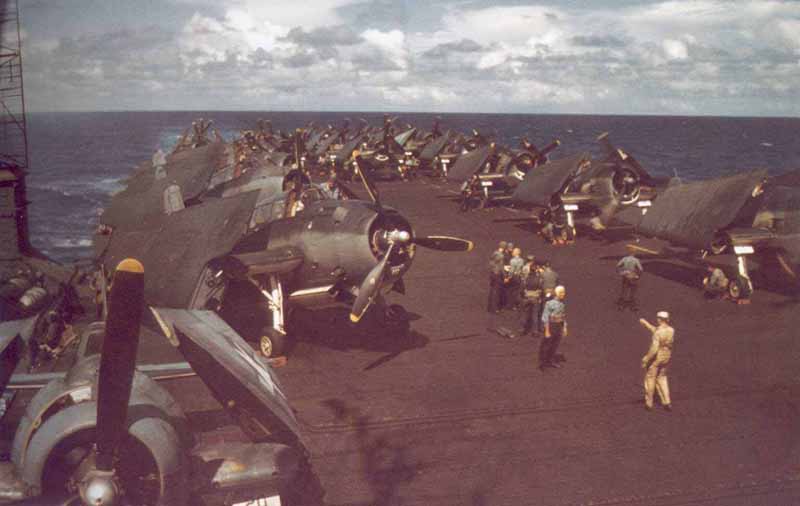
| Now we get into some serious color shots
.. |
| From the web
An SBD taking off of CV-6 Enterprise sometime between
May 12, 1942 and June, 1943. We can tell from the style of National markings
on the plane. The plane colors would be USN blue-grey over ANA 602 Light
grey. Notice the deck is a definite dark blue-grey color. |
 |
|
|
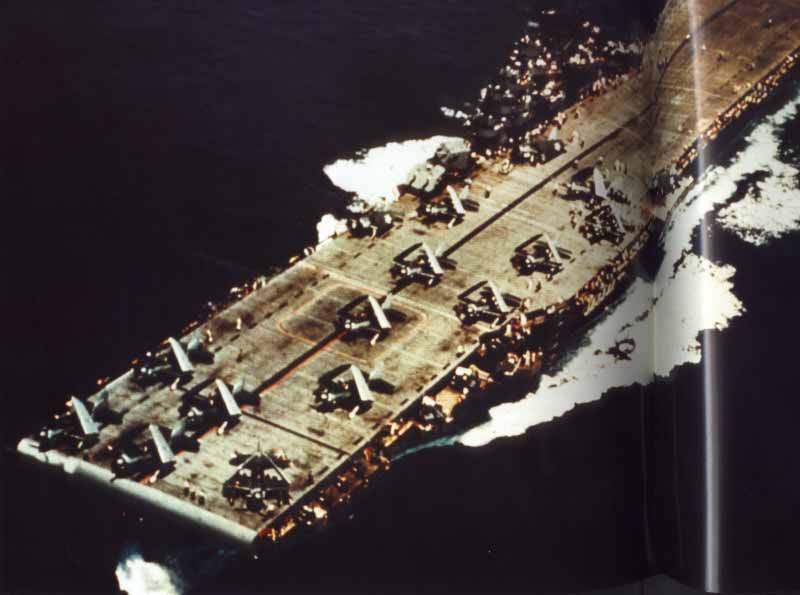
| From the web
..photo of planes preparing to launch from
CV_8 during the Battle of Midway. That pretty much dates the photo as just
after the Doolittle Raid, the deck is 250-N, no question.
From the web with no accreditation on the site as to the origin of the
photo,
..an actual color shot of the Hornets deck with tied down B-25s.
Some might argue the foreground deck color shows it as mahogany stained
but look farther aft, it turns grey about where the B-25s main wheel is
and stays grey further aft. Also notice the deck is greyer than browner
to the left of the photo. Most likely the wood color in the foreground
is an effect of the light and camera angle, not the true color of the deck.
Later there will be some links posted and if you dig deep enough in the
one to Todd Joyces site (son of the Joyce who was a Doolittle Raid B-25
pilot) youll find an excerpt from an interview with a Hornet deckape,
he mentions that after coming through the Panama Canal they put into some
bay and repainted the deck blue with mops and buckets. (NOTE- it does
occur to me that this could be a still from that recent waste of film Pearl
Harbor but having never seen it, I dont know). |
 |
 |
|
|
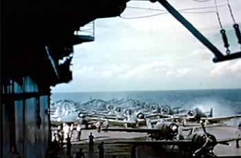
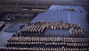
| The next four photos are from a John Ford film presented to families
of the men of VT-8. This film has supposedly never been show in public
and the 50 odd surviving copies all belong to descendants of the men of
VT-8. This was made from films shot by Ford and Hornets crew, all arranged
by Capt. Mitscher. These are all from the web and there will be a link
at the end of the article, there are more photos there. Every one of these
photos show a blue deck. These are all May to June, 1942 timeframe.
Some brown in the forward bit of deck but thats the lighting. |
|
|
|
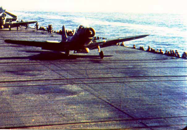
| Blue deck with some leprosy due to air operations and wear. |
 |
|
|
| Ens. Gay, dated May,1942. Blue deck. |
 |
|
|
| Now thats really blue! |
 |
| From the book, SBD between May, 1942 and June, 1943, we can tell by
the national markings on the plane. Again USN blue-grey over light grey
plane, deck is 250-N. Exact carrier unknown, |
 |
| From the book
..CV-6 launching an SBD-5 into the sun. Plane markings
show it to be post September, 1943 as it has white bars with a blue surround.
Plane should be in tricolor camo of dark sea blue, intermediate blue and
white. The lighting angle produces enough glare to make seeing the color
demarcations on the plane very difficult and adds a false color to the
deck in areas. We can see the deck is 250-N even with the lighting problem.
There is also probably some of the Kodachrome gold happening. |
 |
| From the book
CVL-26, post September, 1943. 250-N deck and youll notice
the crewmens dungarees are much darker than the deck. If theyre darker
in color, they will be darker in B&W. |
 |
| From the book, CV-20 with planes preparing to launch. This is sometime
during 1945 from the color of the planes. 250-N deck and again the dungarees
are much darker. |
 |
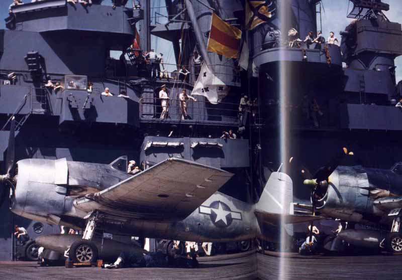
| From the book, CV-7 Wasp during August, 1942. 250-N deck showing some
wear, USN blue-grey planes showing much lighter than the deck and again
the dungarees are much darker than the deck. |
 |
| From the book
CV-7 refueling Buchanan during August, 1942. Notice the
blue gutter which is 20-B and the wooden portion of the deck which is 250-N.
The wood is a bit lighter and greyer than the metal. |
 |
| From the book
CV-7 anchored in San Diego harbor in June, 1942. The
planes would have USN blue-grey topsides. The whole photo has too much
brown to it, look at the water. In any event theres just a little too
much glare off most of the deck to make an accurate guess as to color.
Combine the glare and the brown shift of the photo and this one wont do
you much good. |
 |
| From the Book, CV-10 Yorktowns commissioning. Fresh 250-N deck and
the dress uniforms are much darker than the deck. |
 |
| From the book, CV-10 passing through the Panama Canal. 250-N deck and
again the dungarees are much darker. |
 |
| From the book, CV-10 sometime during 1943, we have two
rarities here as well. First look the the lead Helldivers starboard wing
underside, the plane is in tricolor camo with a plain cockarde (no bars)
this
is one of the very few photos showing this combination of camo and national
marking Ive ever seen. The second rarity is the guy in the light shirt
just in front of that plane, for once dungarees appear lighter than the
250-N deck.
From the book
CV-10 during her shakedown cruise. The decks looks brownish
but look at the plane behind the 1, its kind of greenish and theres some
yellow creeping in to the point on the star to the lower right. I
think were seeing several things here, first is some of that Kodachrome
golden wash beginning to affect the photo this was taken from, second
some odd effect of the lighting angle and third the dreaded deck leprosy,
which will become clear in the next photo. |
 |
 |
| From the book, again CV-10 on her shakedown cruise. 250-N deck but
showing serious signs of leprosy Ignore the little bit of distortion
to the right and the bright line, this photo crosses the binding of the
book. |
 |
| From the book
CV-10 launching an Avenger, supposedly on the Marcus
Island raids of August 31, 1943. The deck shows as badly faded 250-N with
some wood tone apparent, or is it the lighting angle? Dungarees are much
darker than the deck. |
 |
|
|
| From the book, another CV-10 photo from the same day, an Avenger preparing
to launch. The deck doesnt look as bad here but there is some glare. Dungarees
again much darker than the deck. |
 |
|
|
| From the book, another photo of the same day launching raids against
Marcus Island, here we see the F6F-3 Hellcats combat debut. In this photo
the deck is much darker than the pervious two. The superstructure appears
to be 5-N Navy Blue of Ms21. Dungarees a little darker then the deck.
Again ignore the slight distortion and bright stripe as this photo crosses
the book binding. |
 |
|
|
| Thats it for photos, draw your own conclusions
about Hornets deck color for the Doolittle Raid, Im pretty convinced
from the photos that do exist of that day and looking at enough B&W
and color photos that she wore 250-N.
Heres a few interesting links:
http://www.doolittleraider.com/
The above is Todd Joyces page. Todds father was Richard O. Joyce,
pilot of plane #10 of Doolittles Raiders.
http://doolittleraid.com/
http://www.ibiblio.org/pha/pha/ph_pics.html
http://www.pbs.org/perilousfight/battlefield/doolittle_raid_midway/videos/
http://www.centurytel.net/midway/main.html
The above has color stills from the John Ford film of Torpedo 8. |